Savings made easy
Bmg Bank is 93 year old, it was initially created as a loan bank, but it became a full digital bank in 2018, offering a debit and credit card, payments, cashback, transfers, balance, benefits plan, savings, everything that a modern bank has today.
In 2020 and 2021 I was the Senior Product Designer responsible for the Savings and Investments plataforms. I was also part of the team responsible for the app and website redesign first redesign, and I was helping the team responsible for the new Design System.
Purpose
The Bmg Savings main challenge was to help clients have an easy way to save money using round-ups from each transaction, which basically means saving the spare change of every transaction into a separated account.
At the time, the clients would also receive the card’s cashback in this account, and the bank would invest it automatically so the client can earn interest over the money saved.
Problems
The product clear problems were that it was built without a clear prioritized backlog. It ended up with a home screen without any visual hierarchy, too much information and a language style that our clients couldn't understand.
To identify the problems from the users perspective,
I followed a simple process:
1. Data analysis from our Adobe Analytics panel
By analysing the data, arranged by time periods,
I realized that our clients used the product in a pretty basic way, not exploring many features the product had
The most used feature was withdraw the money to the main account, so the clients could use the money for something they needed
Since the money inside Bmg Savings would become an investment only when it reached 50 reais, only 3% of the users had the money automatically invested
2. Qualitative, over the phone, interviews, and a quantitative research sent through a form in an e-mail to part of our clients
3. Conversations with Customer Experience Specialists to get from them what people were calling to complain about
Discoveries
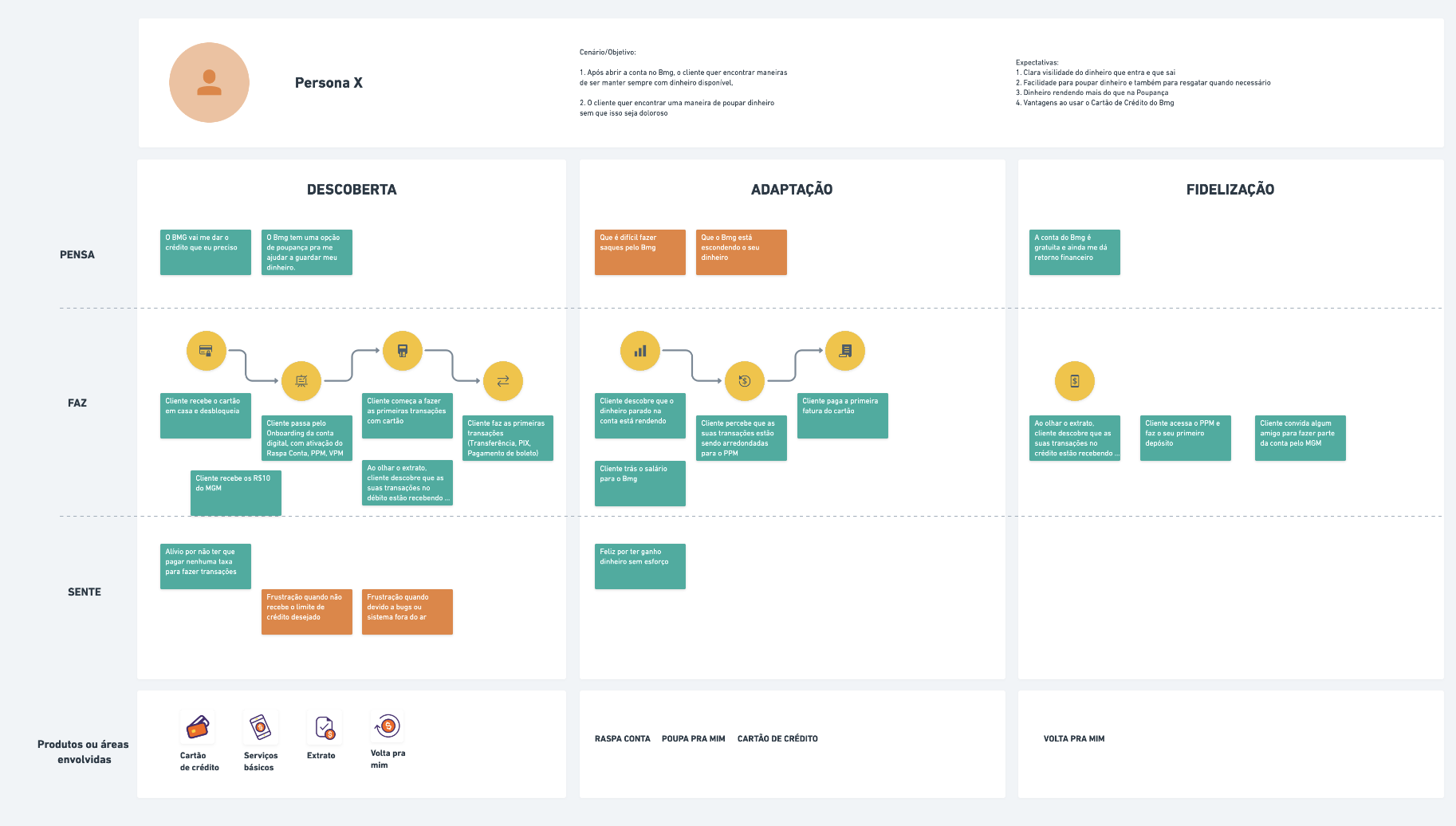
We discovered the main reasons for joining and using the product, and realized why the Goals setting feature wasn't being used. Our clients didn't want to set a big goal, just save some money they could use on emergencies.
Clients also had trouble to understand the general rules of the service, but they understood the concept of saving money without even noticing it.
We talked to some customers who cancelled the service, and they said the main reason is that they needed to use the money but they didn't realize that they could just transfer the money, and not deactivate the service.
The quantitative research brought a lot of information. The main highlight was the clients who didn't have Bmg Savings activated were also interested in saving money but they just couldn't understand how to use the service,
it was too complex.
Process
In order to plan this redesign and bring up a proposal that would change more than just the UI of the product,
I followed a process.
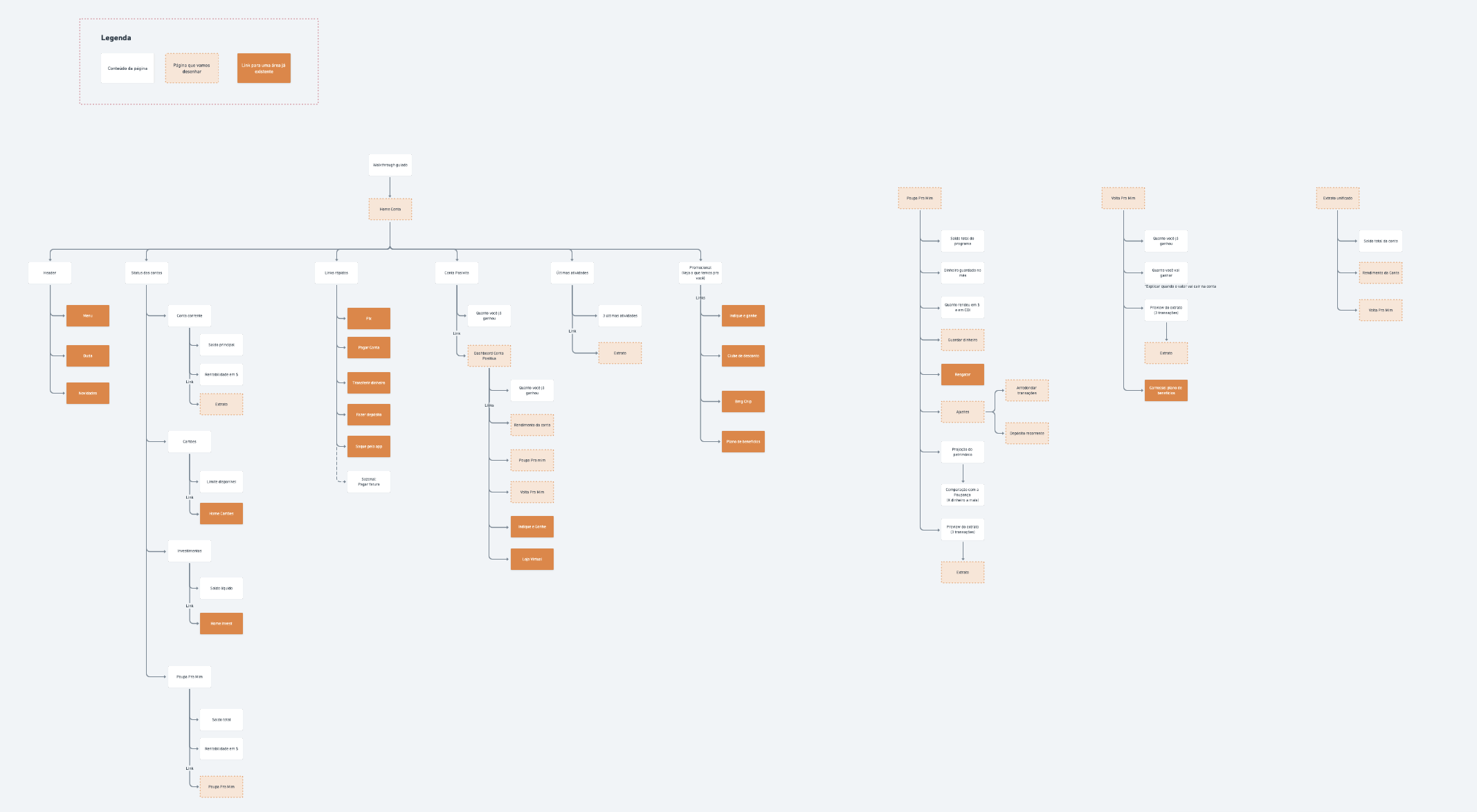
First analysed the current state of the user journey related to this product to improve the communication with the user.
Then the team discussed how the changes in My Savings could have an impact on the architecture of the entire app, and ways to improve the hierarchy of the product by removing or add some features.
We did sessions of sketches and wireframing between the designers involved.
After the first prototype, I conducted a usability test with users who used Bmg Savings before and users who didn't.
Proposal
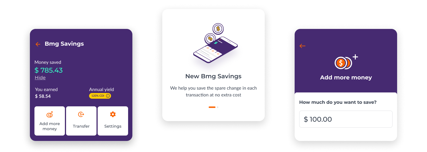
To address the problem of awareness about the product, we proposed an experiment that would be triggered by the first purchase of new clients.
Once the client makes his first purchase by card, the app would send a notification, and by entering the app, the user would see a screen asking if he/she/them would like to save the spare change.
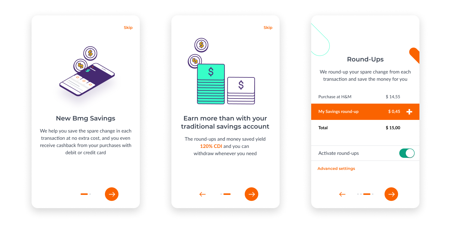
If the user decides to save the chance into Bmg Savings, then we show the onboarding flow for the feature, that explains its main functionalities.
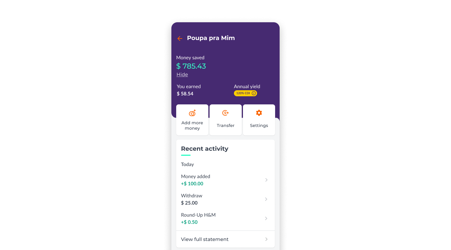
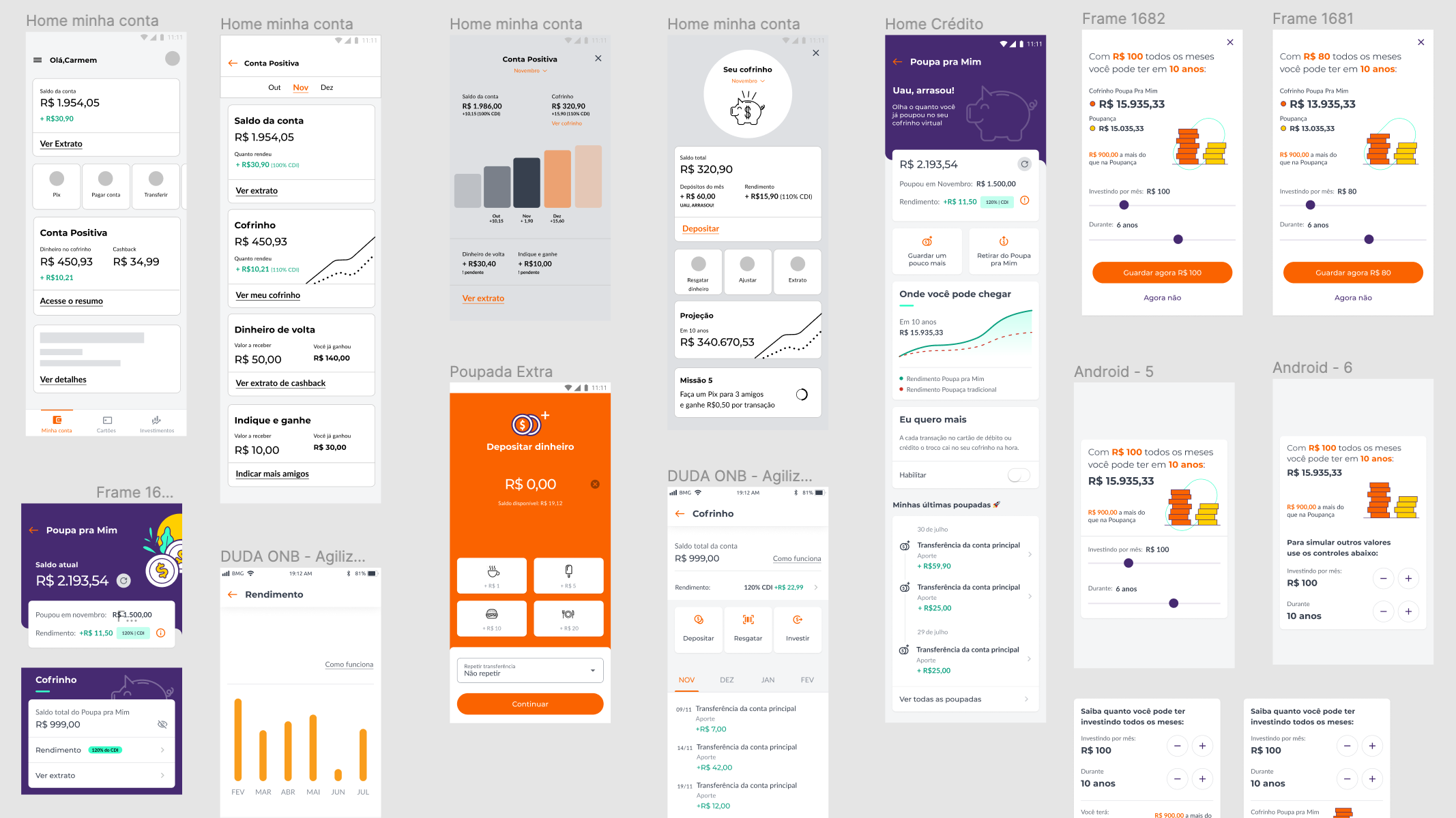
The new home screen for Bmg Savings became much simpler than the previous one, with clear information hierarchy. Now the main functions are highlighted at the top, while we present some cool new features as the scroll goes.
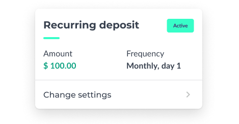
The "recurring deposit" allows users to save a fixed amount of money with a determined frequency. Users can cancel it anytime.
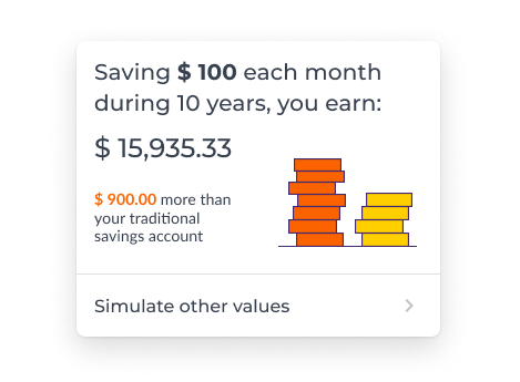
The proposal also included an investiment simulator, where the users have a simple way to understand how their money are goint to grow over time.