Moto tips, tricks and treats
Our phones are getting cool new features and becoming smarter every year, but it may come as a surprise that the majority of users don’t get to play with most of the features during the phone lifetime. As the smartphones become more complex, the functionalities are usually more hidden inside menus, settings or app groups.
Understanding this problem, Motorola uses Moto App to display all it’s phones easy settings, such as do a quick gesture to activate flashlight, do an easier screenshot or flip your phone to “do not disturb” mode.
We decided to embrace this “feature discovery” issue, and take it even further by creating a more engaging and exciting way for users to learn about their phones, using Moto Tips.
User moments
While designing we had to keep in mind users most common behaviors when exploring the phone. We tried to understand the user paths in the first weeks of a new phone, based on feedback from an out-of-box conducted research.
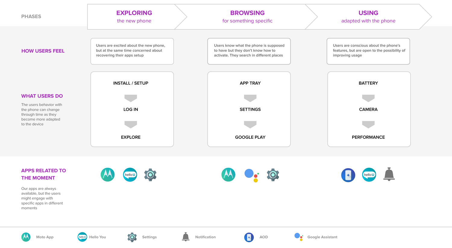
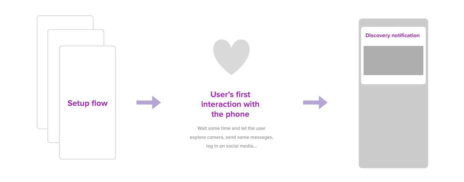
We understood that we should allow some time for the users to explore the new phone, sending a communication only after a few days, in case the user hasn’t interacted with the Tips by her/himself.
Content structure
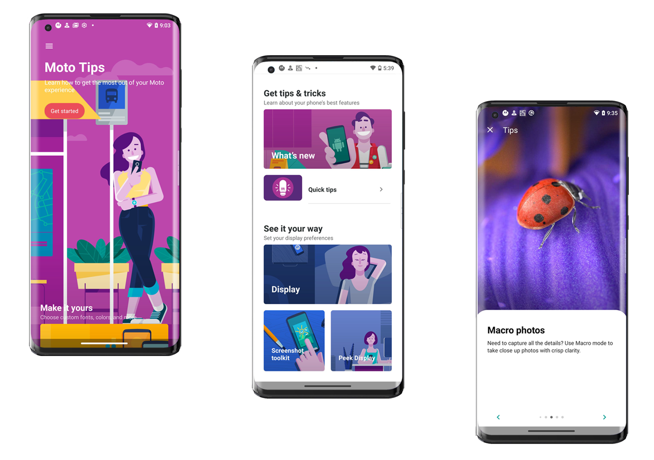
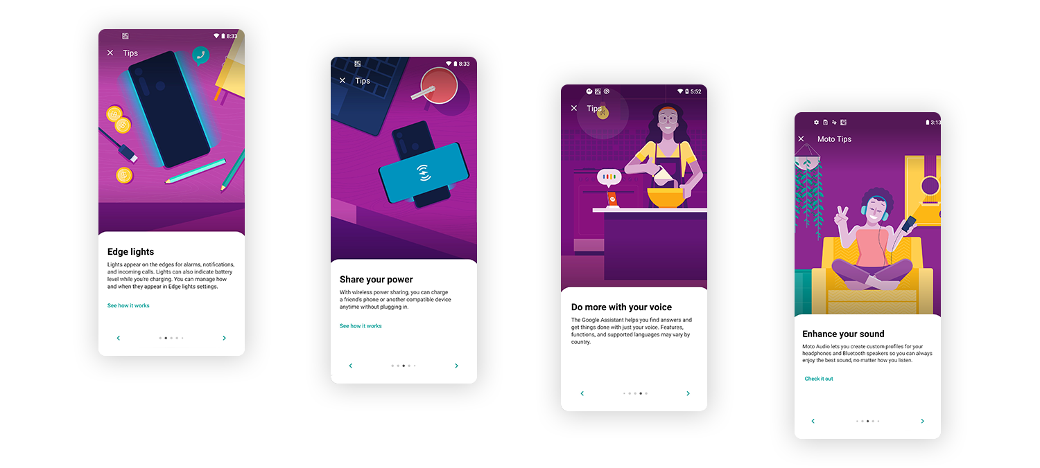
Moto App already had its own information architecture, so we created a new “Family section” for the Tips divided in two main areas: What’s New and Quick Tips. Both contents may appear in the dynamic hero whenever the user opens the app.
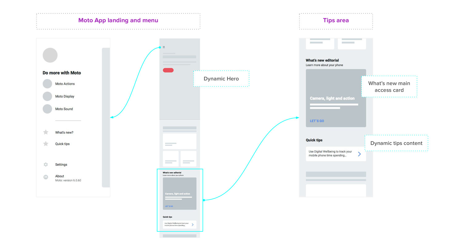
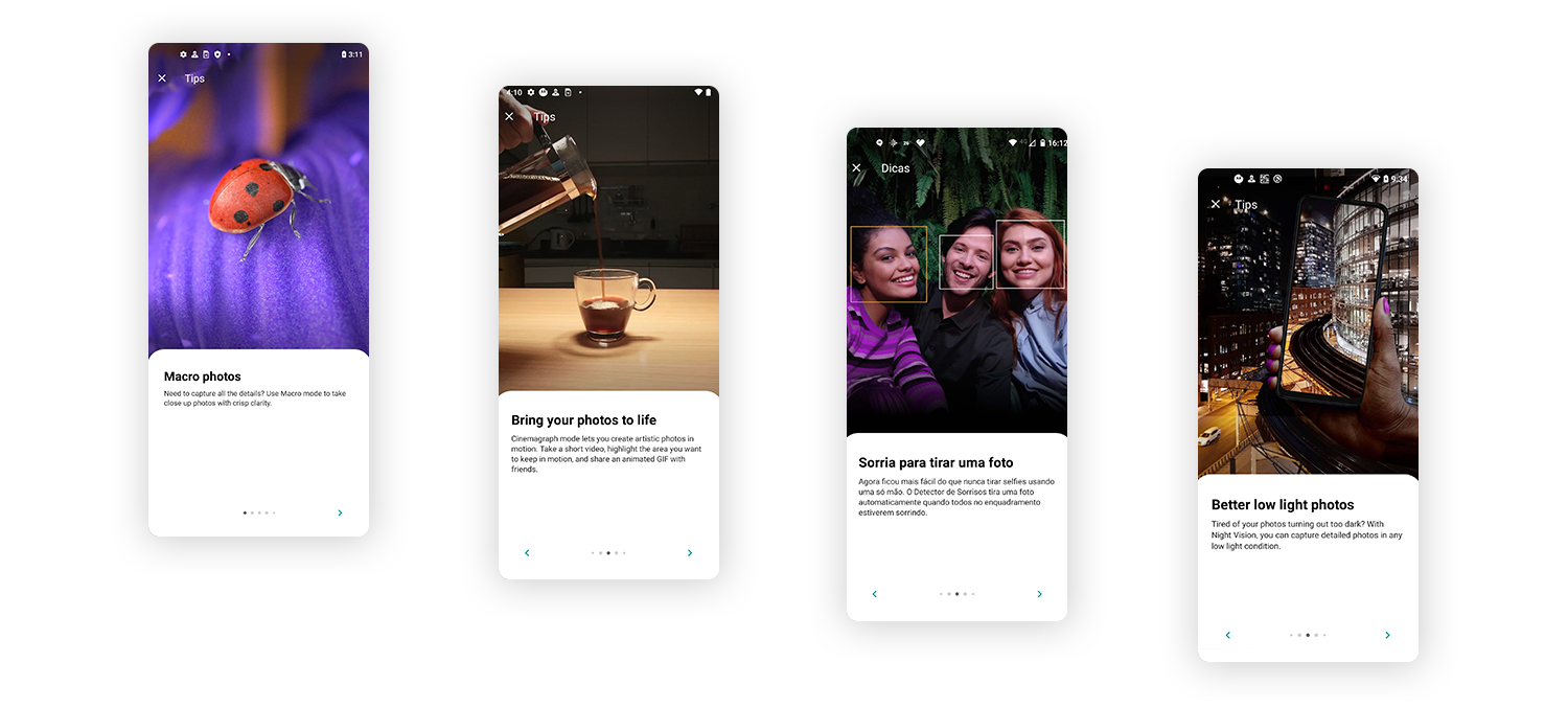
What’s New is an editorial content that describes with an article everything that is the highlight of this specific device. Something that users have never seen before. Quick Tips is a carousel of small texts and images that give users an introduction to features such as Google Assistant, camera modes (most users stick to the basic point and shoot), sound enhancement, storage, navigation, etc. After the first release and research inputs, we added links so the user could go directly to the feature setup.
Motorola releases almost 20 new models each year. Some devices have specific cool features such macro/wide lenses, wireless charging, stylus pen, etc. When planning the content, we selected which phone models would have tips for its specific features, and which model would have only the general tips that are common across all devices. We had to gather all the information and create images prior to software lock.
Images
Moto App images heavily relies on illustrations crafted by the Motorola team, but for the tips we decided to introduce photos as well, because some features (like camera modes) are just better explained with pictures.
Users opinion
Our UX Researcher conducted an usability test with 6 users in one of Motorola Service Repair Centers in São Paulo. The key goals were to learn more about how users would interact with Moto tips, get users feedback about content and Design, detect any discoverability or navigation issues. Here are some key findings:
1. Most participants said that don't have time to look for what is new on their phone so they liked "Moto Tips" in general, they thought very interesting to have a place to learn more about the phone;
2. The visuals were considered very appealing;
3. Navigation was considered simple, users were able to scroll down on the What's New page, swipe left or click to go to the next page to check the tips;
4. Many participants were not sure if all the items on the tips were actually on the phone by default or would need to be downloaded. In that case they missed a tutorial or a link to the page to set up the feature;